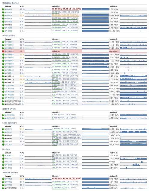
Announcing Bosun
Kyle Brandt
Imagine if alerting was what you wanted it to be:
- Every alert you received was actionable, and there were few false alerts
- Notifications were actually informative
- You received alerts in time to fix problems before they impacted your users
This isn’t the world we live in…
- We accept lots of notifications from our alerting system that are not actionable
- The notifications don’t tell us about the problem
- We get paged when stuff is dead and not when it is sick
In order to resolve the dissonance between reality and what alerting should be we need:
- An expressive way to evaluate alert conditions that isn’t a 1:1 mapping to the metrics
- Alerts backed by time-series and not just recent values
- A way to to make rich notifications that include useful information
- A way to iterate fast with alert design so that our alerts are continuously improved
A little less than a year ago, Matt Jibson and Kyle Brandt set out to create a system to solve this and other problems in monitoring; we call it Bosun. Our belief is that achieving excellence in alerting is a complex problem and requires a powerful and flexible platform to design alerts. Therefore, Bosun’s strategy is to provide a framework that enables the operator to create intelligent and informative alerts. We believe that you are smarter and more creative than any monitoring system can be when it comes to your environment.
In order to achieve that, at the highest level Bosun provides:
- An expression language (a small domain-specific language) designed to allow for the creation of highly flexible and specific alerts
- Notification templates that allow you to include whatever information you think is relevant
- A web interface the provides a workflow for more rapid iteration with improving and creating alerts: Graph -> Expression -> Rule + Template -> Test the rule over history
The Expression Language
We believe that every alert requires action. An alert asks for your attention, and human attention and time is a valuable asset. So alerting is about owning the operators attention. Taking action with alerts practically means one of two things. If the alert was accurate, then you fix the issue that triggered the alert. If the alert was a false positive, then the alert should be tuned in a way that the false positive won’t trigger the alert. This is where things tend to fall down because alert evaluations are not powerful enough to be tuned. With Bosun’s expression language, you can tune alerts in the following ways:
- Alert thresholds based on history vs static thresholds (or both combined)
- Statistics functions: Min, Percentile, Median, Deviations, Forecasting. You can change the duration that these evaluate over (i.e. 5 minutes, 1 hour, 1 week?)
- Scope-aware: How should components in your environment be grouped? By Host, subsystem, cluster, a combination of those things
- Boolean conditions: The interaction of multiple components
These possibilities, when applied selectively by a skilled operator, provide ample ways to reduce alerting noise.
Notification Templates
Once you have someone’s attention with a valid alert, you need to direct them to the problem as accurately as possible. Our notification templates use the Go template language, which means they can be quite flexible. Notifications in Bosun allow you to:
- Include breakdowns of information related to your alert as embedded graphs, html tables, or whatever else you think makes sense
- Include information that wasn’t directly related to the alert: i.e. CPU of a host even though it was a memory alert
- Generate links to your dashboards or other sources of information
- Includes notes about why you created that alert, caveats, and other information the person being notified should be aware of
The Workflow
One of the main issues with alerting is that there is so much friction to tuning alerts that it doesn’t get done. One of Bosun’s goals was to provide a faster iteration cycle for creating and tuning alerts by making the web interface an alerting IDE: Graphs in Bosun’s interface link to expressions, which then link to alert rules and templates. You can then test alerts before implementing; the results of a rule and template can be tested in the interface. You can test how they will behave currently, how they might have behaved at a past time, or generate a timeline of how they might have behaved over a range of time.
This means that your alert tuning doesn’t need to be totally reactionary. You can test alert changes and see how and when they would have triggered over the past weeks (or longer, if you are patient). This results in less alert noise being sent to operators.
But wait! There’s more!
Bosun has also attempted to make some problems in monitoring easier:
- Getting data into the system: our agent (called “scollector”) runs on Windows and Linux and starts sending data to Bosun
- Applications can push metrics to the system via JSON API calls
- Human maintenance: Properly designed alerts will apply to new systems, and services are auto-discovered by scollector. This means you don’t have to remember to update your monitoring most of the time when a new services and hosts are deployed (as long as scollector is pushed out via your build or configuration management process)
We hope you go try this out. We have a docker image that has everything you need—just follow the getting started guide. We hope Bosun is useful to the community. We need your creativity and ideas to continue to grow it (and some contributors would be nice too!). We owe a special thanks to everyone else at Stack Exchange for:
- Contributing to scollector – Greg Bray has been working hard to fill out our Windows metrics, and Sam Torno did the same for Linux
- Getting a docker build – Peter Grace (who also did a lot of the dogfooding)
- Manning the front lines to keep the site up while we built this – the rest of the SRE Team
- Feature ideas and monitoring concepts – Tom Limoncelli and his monitoring chapters in The Practice of Cloud System Administration
- Letting Matt and I go tilting at windmills – Stack Exchange, Inc.
The Importance of Observability
Kyle Brandt
Site reliability engineers, in the most general sense, are charged with a clear mission: efficiently keep the sites reliable. Reliability can be broken down into two main facets: availability and performance. This is about where it stops being straightforward and everything becomes nuanced. This is because you have to start defining what availability and performance means for your systems (which is generally driven by the mission of your organization and how your systems fit into that). Even more complexity comes into play when you consider all the activities an SRE team engages in to achieve these things. For example: configuration management, capacity planning, restores, fault tolerance, and security to name some of them.
How you define availability and performance in your organization is a topic worthy of its own set of posts; and the details of all the activities an SRE team participates could fill a library. An SRE team needs to start somewhere and have a strategy to tackle all of this. There is no one answer, but achieving a high level of observability needs to be a key strategic component for any SRE team.
Observability is the Foundation
Observability is the degree and facility in which your team can gain insight into the behavior of your systems. It is worth noting that the scope of your systems is likely quite broad; it includes the obvious things like your applications and hosts, but also includes things like processes, workflows, and team dynamics. Having insight in your systems means:
- Questions operators have about their systems can be quantifiably answered with minimal effort
- Operators have rich mental models of how their systems function
When you have to decide something you can either guess or use “the science.” Without a set of systems for observability in place you will end up guessing (not the educated kind) or be terribly inefficient. A good understanding of how systems work is what allows operators to be effective and avoid disastrous mistakes: observability can drive that.
Decision Making and Incident Preparedness
Observability is key to the strategy for an SRE team because it informs and impacts nearly every other activity that team engages in. I’ve written about the OODA loop before which stands for Observe, Orient, Decide, Act (You can think of Orient as “Analyze.”) It is a military strategy that suggests you can be successful when you can rapidly and successfully iterate through this loop quickly. It is also a tool that is useful for thinking about site reliability operations as well.
OODA is carried out at both the macro and micro levels (planning and incidents) by SRE teams. As an example, we can imagine what making system design decisions as a team is like without good observability (and since we have likely all been there, you can probably just remember.) The observation phase will be based on people’s memory and is frequently skipped. Orienting or analyzing that information as a group will have conflicts because people don’t agree on what the facts are. This can result in arguments about the person’s recollection of the facts instead of the issue at hand. Decisions end up being prolonged and half hearted because of the uncertainty of their basis. Lastly, action will be hindered because a strong consensus hasn’t been reached because people don’t trust the baseless decision. Even worse, people question if this is even the system they should be working on at all.
Many have also probably been through outages when observability is lacking. Lots of time is lost trying to figure out what is even going on. Orienting is difficult because operators lack the internal model of the system that observability provides over time. As a result of these things decisions and actions are chaotic. Or more simply put, it’s amateur hour.
In contrast, the picture is entirely different with a solid foundation in observability because everything becomes data informed. This is different from “data driven” because you can trust people’s intuition. Due to good observability they have developed keen instincts about systems over time. When it comes to system design decisions you are in a much better position because chances are you are designing the right thing in the first place. Team members will bring their observations to the discussion. If there are questions about the facts, instead of arguing then you can just look them up. Decisions will be made with more confidence and faster because they are based on evidence. Lastly, action will have more consensus behind it, even if people didn’t agree they at least know the choice was based on something.
You never know what the next incident will be, but if you have good observability then your operators will have a deeper understanding of the system and will be far more prepared for the unknown.
Other Benefits
Observability positions a team to do more capacity planning by enabling them to see constrained resources and forecast growth. This can help reduce the vicious cycle of fire fighting that many SRE teams are locked into.
Since observability leads to insight, team members are learning more about their systems which generally is a common source of fulfillment for engineering types.
Convinced? 5 Steps to Achieving Good Observability:
In order to achieve good observability an SRE team (often in conduction with the rest of the organization) needs to do the following steps.
- Instrument your systems by publishing metrics and events
- Gather those metrics and events in a queryable data store(s)
- Make that data readily accessible
- Highlight metrics that are, or are trending towards abnormal or out of bounds behavior
- Establish the resources to drill down into abnormal or out of bounds behavior
Each of these steps largely depends on the previous step to be successful.
1. Instrument your Systems
Brainstorm what key and useful metrics exist for your system. Make those metrics easily accessible (i.e. standard APIs like json via REST or by providing a destination to push to) and document what they are and what the implications of those metrics are. This largely falls on the developers of systems, and DevOps culture can go a long way encourage application developers to empower the operations side of things by doing this. At the highest level you can break metrics and events into two categories:
- Objective Oriented: These metrics reflect the mission of your organization. For example they include client facing measurements like response time, availability, error codes, items sold, number of users, number of active users and rate of content created.
- Diagnostic Oriented: These measure aspects of the system that allow you to achieve your objects. These include system measures such as OS, network, hardware, middleware, cluster, and application metrics. These also include response time and availability metrics but they measure components and parts of the pipeline that contribute to your objectives.
Good Metrics also tend to have these properties:
- High Resolution: “High” is qualitative, but a higher frequency of data collection means you will have more insight into the shape of your data (i.e. is it bursty)
- Lossless: This means that there isn’t missing information from your metric. This can often be achieved by publishing counters instead of rates and letting the display side of things calculate a rate from that information. Also not pre-aggregating things into averages can be useful (or if you are going to do that also aggregate the data into multiple percentiles)
- Specific: More specific metrics can often be more useful to understanding a system and drilling down into a problem. For example, with something like CPU utilization it is better to report something like %user, %system CPU time breakdowns and let something later in the pipeline aggregate them.
It is also worth making a point to instrument your own internal “meta” systems such as bug tracking and documentation.
2. Gather those metrics in a queryable data store(s)
This is a key intermediate step to making this data accessible. Data generally needs to be stored over time in order to give it context (although the time of each datapoint isn’t always important for things like histograms when it is processed later). Having this step enables things like:
- Building dashboards
- Enabling capacity planning
- Allowing operators to explore the data and learn
- Allowing people to invent cool stuff you didn’t anticipate
As a rule of thumb, less data stores are better because it makes it easier to work with the data (although specialized databases for things like time series might be worth the tradeoff because of features and scalability.) For time series data in particular, a couple of useful qualities are:
- Scalability: This enables one to collect a lot of metrics, at high resolution, and high retention
- Aggregation: This encourages a shift from host/process oriented views to cluster and service oriented views
3. Make that data Readily Accessible
If there is a lot of friction to view the data then people won’t have time or energy to do it. This is why it is important to have good dashboards and APIs to allow easy access for your operators. Good dashboards tend to have the following attributes:
- A fast responsive UI to allow for operators to drill down and explore easily
- Enables operators to create their own dashboards and graphs
- Highlight problems
4. Highlight metrics that are, or are trending towards abnormal or out of bounds behavior
Ideally a team ends up collecting a lot of data. This means humans can’t process it all and therefore your systems need to ask for operator attention. Essentially this is alerting. However it is important to understand that alerting doesn’t always mean “emailing”. It can also mean things like publishing something to a dashboard or logging it.
Traditionally alerting has been done on current values, but anomaly detection and forecasting are becoming a reality thanks to some work done at Etsy.
Alert noise / desensitization is a plague in our field, my belief is that future systems will allow for more carefully crafted and adjustable rules to reduce the noise. Keeping this under control is also largely about discipline and remembering that every alert requires action.
5. Establish the resources to drill down into abnormal or out of bounds behavior
The above steps are a gateway to observability. This is because the nature of collecting metrics is resource constrained. You can only collect so much information without noticeably impacting what you are trying to observe. Eventually you are going to need to drill down into problems or explore further why metrics are behaving in a certain way. There are three common activities for this:
- Log analysis: Digging into your system logs for information. System logs can also be a powerful source of metrics (especially things like web logs) if you parse them and feed the results into your monitoring systems
- Profiling: This the activity of sampling programs to figure out what they are doing – generally at a much higher resolution than collecting metrics (computer time (sub 1ms) instead of human time)
- Tracing: Collecting every single thing a system is doing (i.e. strace or DTrace)
Although my path to observability puts an emphasis on collecting metrics and events, this step is also crucial to observability.
Use the science, Luke
If observability is one of the key components of the strategy for your team, then it sets the tone and foundation for everything else. It can create a culture of constant learning as it provides a medium for learning about your systems and proves a source of information for productive analytical arguments. Whatever your strategy is, you need to consider what role observability plays in your team. And remember: Use The Science.
Escaping the Cycle of Technical Debt
Kyle Brandt
If you are not familiar with the concept, technical debt is essentially the idea that you build and program things quickly, skipping the niceties in order to ship, and then fix it later. By putting things off you build up debt that needs to be paid down later. One of the places this most commonly shows itself is in performance.
It works like this. Developers make features because the business and users want features. Performance is hard, and the benefits of good performance are not usually as obvious or concrete as the benefits of new features. Therefore, nobody really pays attention to performance or it is intentionally skipped until it gets so bad that people consciously notice it. Then the developers need to do a “feature freeze” and fix things until performance is at least “okay.” again. If you don’t mind the cliche, the feature freeze is the “Rinse.”, and then it all starts over again — “Repeat.” This is the cycle of technical debt.
At Stack Exchange I saw this happen, the developers had to stop working on features and fix performance because it got the point where we were getting timeouts.  However, here is where things get interesting: After that, it never happened again.
“Impossible!” No, it is not impossible. In reality, of course there are still things that slip by, but the overall macro cycle of technical debt, when it comes to performance, is avoidable. And if you order my VHS series for 19.95, I will tell you how.
In all seriousness, even if there is no one recipe, from my viewpoint Stack Exchange escaped the cycle through culture, and making the right performance investments. The culture that lead to this consists of:
- Placing a value on performance: “Performance is a feature”
- Well integrated development and operations
- A sense of craftsmanship when it comes to performance
Good performance makes a system enjoyable to use, everyone has to believe this idea. When development and operations are well integrated the teams empower each other, and since performance takes both programming and systems knowledge this is needed. Lastly, if good performance is an aspect of good craftsmanship, it becomes a source of pride.
These cultural aspects at Stack Exchange and the performance investments made enforce each other. I don’t think we could have one without the other. But if there is a secret sauce, it feels to me like it is the performance investments we have made. These investments follow a development pattern that results in instant feedback when it comes to performance:
The 3 Step Process to Good Performance Investments:
Step 1: Collect your data in a queryable way
I can’t emphasize enough how important this initial step is. Your performance data such as logs and system data (i.e. CPU/Memory/Network etc) needs to be in a format that can easily be queryed, extracted, aggregated, and molded in a way that leads to discovery. We use SQL Server for our logs and system data. It doesn’t have to be SQL, but I think that rrd, the common storage format used by systems like Cacti, although good for displaying time series graphs does not fill this requirement due to the difficulty of extracting data.
Step 2: Discover the Important Metrics
Once you have the data in a queryable format, you can then explore that data and discover what the important metrics are. Once we started capturing our web logs in SQL we were able to add custom headers that tell us things like which route is being hit, and measure performance grouped by route. If your data isn’t queryable the discovery process has too much friction.
Step 3: Automate and Integrate the Important Data
Once you have found the important data by exploring it with various queries, those queries should be automated and integrated into your application. Then with every build (rapid integration or frequent building helps) you get instant feedback. At Stack Exchange we have a dashboard that includes graphs from log data, system data, profiling results, and exceptions. We can explore our web logs with a data explorer instance. Also, some of this such as our profiler results are part of every page load.
This process leads to an instantaneous and effortless return of performance information. This eliminates the friction around discovering how your performance is changing. With this information readily available and in your face, it enables a culture where keeping up with performance becomes an aspect of good craftsmanship.
These tools we have created are performance investments. Investments are the opposite of debt. Investments give returns where as debt has interest. When you make these sort of performance investments the cycle of debt is broken and you start collecting the returns. For the most part, people in this world are either collecting returns or paying debt — and collecting returns feels damn good.
Monitoring Systems – Your best friend. Really.
Peter Grace
At some point in your career as a Systems Administrator or other Person-Of-Responsibility-in-IT, you will find yourself stuck in the unfortunate position of cleaning up a mess that was totally preventable, if you had known the signs beforehand that the problem was imminent. This fact is 100% assurable, as I have yet to meet a seasoned SysAdmin who didn’t have a war story similar to “man, if I was only monitoring disk space on server X…”
Monitoring is an extremely important tool in your arsenal of preventative measures. Monitoring is important for a great deal of different reasons:
- Monitoring allows you to send alerts if certain conditions are met,
- It allows you to visualize trends in data,
- Provides a method of assurance to the customer that their consumed services are guarded,
- Allows you to do internal benchmarking for when you need to come up with budget/spend numbers.
There are many different products in the monitoring sphere. Some are extremely expensive and meant only for enterprise use and there are many that are open source and therefore free to use. My personal favorite is Nagios, though it does have some shortcomings that I will touch on later. Most monitoring systems follow the same basic recipe: You configure hosts, which in turn have services or metrics you want to monitor. The monitoring system will “optionally” alert you if you configure it to do so. Most monitoring systems have a method of keeping historical data and graphing it. This is not only a great way for you to look at pretty graphs; the management staff will get excited seeing information visualized in a way they’re used to seeing.
There are several methods of monitoring. The most basic and least useful method alone is a simple ping test. Products that provide this feature give you a simple up/down alert if there’s an outage, but honestly, the users breaking down your door will be a more effective alert. Most monitoring systems will give you the ability to not only run ping tests, but also have checks that incorporate SNMP (Simple Network Monitoring Protocol) statistics. This is better than a simple ping test, but in my opinion still short of the complete picture I’d like to see. SNMP does have its benefits, though: since it’s been around practically since the beginning of time, lots of equipment supports it out-of-the-box. It’s the primary method one uses to gather statistics about your routers and switch interfaces, including drops/discards and packet saturation rates.
Going beyond simple ping and snmp monitoring, many monitoring applications allow you to have custom checks that give you metrics for items SNMP misses.
For instance, the nagios plugin exchange provides a plethora of check-metrics that other users have written with varied themes from temperature probe
monitoring to advanced Microsoft SQL statistics checking. In particular, one Nagios addon that I cannot live without is the “nagios-wsc” project, which you
install on a windows IIS server and it in turn provides the ability for Nagios to check windows statistics over WMI. Being able to do this vastly
improves the metrics you can extract from windows servers. At the time of this writing, I’m not sure if a similar interface for PowerShell exists or is
in the works, but that would be a “must-have” addon, as Microsoft has said that they’re moving away from WMI in favor of PowerShell, at least as far as Exchange
is concerned. (As commenter Jim Butts points out, I don’t have citation for this and so I’m going to strike it from the post, though I swear I remember reading at one point that Microsoft intended to replace WMI with PowerShell. This might have only been related to the Exchange family of products, though, so don’t take it as gospel. Also worth noting, as another commenter explained, WMI and PowerShell are two different technologies meant to do two different things. WMI is an instrumentation interface, whereas PowerShell is a scripting language. It just so happens that you can get some information with PowerShell that you cannot easily get through the WMI interface.)
One of the major pieces of any monitoring environment is the ability to alert administrators of an impending problem. Many admins default to e-mail for this, but not many people realize that most mobile phones are fantastic SMS modems. Find a prepaid model that lets you send SMS’s from a serial/usb connection via AT commands, and now you have not only an out-of-band notification method, but you’ve saved yourself a bunch of money on specialist hardware. I’ve also heard of some people using Asterisk to do voice-dial alerts; when the alert hits the system, it Text-to-Speech’s the alert and then plays the audio over a telephone call to the remote party. Pretty slick and high tech, but in my opinion that’s a rather big system to rely on for monitoring. Generally, simple methods of alerting, with less moving parts, makes for a more stable and trustworthy alerting platform.
A helpful part of many monitoring systems is being able to group hosts and services into logical containers. This ability lets you not only monitor a whole logical service from one view, but also allows you to quick-add new servers to a group and immediately have that server’s checks already applied to it by virtue of being a member of the host or service group. If your monitoring system supports grouping and you are not using it “you are doing it wrong.”
Do you need a monitoring environment? Yes. There is no other answer to this question. If you have even a single server in your environment, monitoring it will provide a treasure trove of information about the system. The only question is, how much do I have to monitor? This depends a lot on your customer SLAs and the expectactions of uptime. As the uptime target grows and the margin for error shrinks, you will need to squeeze more and more information out of your environment to maximize the “magic twilight” between a server showing symptoms of impending troubles and “THE SYSTEM IS DOWN.”
Having a lot of stuff monitored also helps with correlation and causation. For instance, you might have a website error showing up on one of your servers, and you start diagnosing that error. Thirty minutes later, you come to find the problem was that the SQL server is bogged down and replying to queries too slowly. If you were just monitoring the web server, you just lost thirty minutes. If you were monitoring both the SQL and the web server, you would have a greater chance of knowing that the problem lay with SQL, not with the web server. All of this data can lead to a condition I call “data addiction,” and it’s a condition that I will attest is pervasive at Stack Exchange. Many of our developers rely heavily on our monitoring data to give them metrics into how the sites are operating.
One thing that needs to be considered when you setup monitoring is the “Who Watches The Watcher” paradox. Simply put, if you become reliant on your monitoring system, you want to trust that the monitoring system is active. There are a few ways to solve this. First off, if your organization has multiple sites, setup a monitoring server at each site and have the monitoring servers monitor each other as well as their other systems. If you have only a single site, then you should probably consider getting a simpler monitoring system to monitor your monitoring system. You’ll never be able to have 100% faith that your monitoring system is foolproof, it’s tough to rely on software that was written by human hands to be 100% failure free, all the time. Regularly auditing the monitoring environment is the best way to keep your faith in the system.
In closing, I’d like to reiterate that even if you feel you don’t need a monitoring system, I’m pretty sure you would still benefit from one. Start small if this is your first time; if you run into issues, sites like ServerFault are a great resource to get good answers. Over time, I think you’ll grow to enjoy having the peace of mind that comes from knowing what your network is doing without having to spend additional time manually collecting statistics on your own.
We Have an Alerting Problem
Kyle Brandt
Hello, our name is Stack Exchange and we have an alerting problem. It hurts us, our friends, and our family. We are not sure how we got here. Sure, we get some extraneous alerts, but everyone does right? Then one day we woke up and had an inbox full of alerts. We wrote it off. We told ourselves that it happens to everyone. But then it happened again, and then again. We don’t want this. We don’t want to live like this anymore. We are ready to pick ourselves up. We are ready to face this problem and live a new, and better life.
Don’t know if you have a problem? Here are some of the signs:
- You get alerts that you just don’t care about, because of this you maybe don’t see the ones you do care about.
- The more serious ones wake us up in the middle of the night when they don’t need to because someone else is already dealing with them.
- When something major happens your inbox is flooded.
- You set up email rules to handle them.
- You are ashamed.
If like us, you have an alerting problem and you have admitted it, I believe finding the righteous path starts with one rule:
Every Alert Requires Action
Every alert requires action. The problem we have right now at Stack Exchange is that alerts don’t require that we do anything. If we are to address our alerting problem — I believe this, more than anything, needs to be fixed. When I mean every alert, I do mean every alert. So what sort of actions can we take:
- If it is real problem and you are dealing with it — acknowledge the alert.
- If it is a false alert, acknowledge and adjust the threshold level
- If the alert was a flood of alerts, acknowledge them and set up dependencies.
In order to do this we need a few things. We need a system that allows to effectively acknowledge alerts without too much friction. We need cooperation from everyone to use this system once it is in place. Lastly, we need to accept that we don’t have the power to cure our alerting problem. We can, however, through constant vigilance, get it under control.
The Three Perspectives
In this three part series I am going to explain a three level framework for monitoring your infrastructure. As an overview, the three levels are:
- Micro: “Ground Level”
- Meso: “Day to Day”
- Macro: “Seasonal”
These levels go from a detailed close up view of your environment to a large-scale view. “Ground Level” monitoring is a highly detailed, micro view of your environment. The “Day to Day” view is an ongoing picture of your entire environment. Lastly, what I call “Seasonal” monitoring is a macro perspective of how your environment changes over months or years.
From my experiences with system administrators, anecdotally I would say that most are only doing the meso level with maybe a touch of the micro when problems happen. The meso level is common because this is what tools like Cacti and Nagios handle. This sort of monitoring system is fundamental to day to day operations. However, the other levels are just important for a high performing environment.
I am breaking this into three levels because each level is handled differently and has different characteristics. Because of the different attributes of these levels there are also different tools suited for each type of Monitoring.
Ground Level Monitoring
“Ground Level” or micro monitoring is high resolution monitoring. By this I mean that you take a lot of samples in short periods of time — generally every second or multiple times a second. These tools are often run from the machines themselves. They also return lots of information. You are probably already familiar with many tools you would use for micro monitoring:
- Perfmon
- Sar
- Wireshark / TCPDump
- Web Logs (or other detailed logs)
- SQL Server Profiler
However, system administrators generally think of these tools as troubleshooting tools and not monitoring tools. The difference is that monitoring is run regularly and is a process for discovering problems. Troubleshooting tools on the other hand are manually run by the administrator as a reaction to a problem.
In order to start having a ground level view, these tools need to be deployed for monitoring purposes, not just troubleshooting. In order to do this these tools should be scheduled to collect data for a period each day. They should all run at the same time so you can correlate the data. Then the data needs to be analyzed, and the relationships between different sources on a regular basis.
The Attributes of Micro Data
The most distinct attribute of ground level data is that there is a lot of it. This attribute has several consequences for this type of monitoring:
- Different sets of tools to process the data are needed
- Generally samples of high resolution data and not complete sets are used
- To correlate all of this, you will need to do some work because it will be different for every environment
Since you are working with samples to make the data size manageable it is good to think about what your samples represent. They might not show things that happen say every hour if you have a 20 minute sample. If you are choosing a set or single server from a farm, you might miss issues that are particular to one server. However, mid-level monitoring like Nagios are usually good for finding these problems. Also, if you choose your samples well you can likely discover things your standard monitoring systems miss.
One other thing to keep in mind is that collecting high resolution data can be resource intensive, so it is possible that the act of monitoring effects the system itself (And no, I am not going to cite a certain physics principle).
Case Study: Web Logs and Perfmon Data
Data Analysis Platforms
Having a platform to work with for data analysis is essential for high resolution data. I have been learning R and using RStudio as my data analysis platform for a week now. I believe this is going to be my standard tool for analysis. R is a domain specific language focused on statistical analysis. Platforms such pysci and R are going to become part of the standard toolkit for system administrators because they allow you to view your data in different ways (i.e. distributions) and provide a lot of functionality to combine different data sources. They are also naturally more programmatic then something like excel.
Getting the Data
For windows the standard tool to get a high resolution picture of the system is Perfmon. With “Data Collector Sets” you can give a list of counters to monitor and save to a perfmon binary file (.blg) or other formats. I used this to collect data from 20 minutes on one of my web servers. We also insert our web logs into SQL Server. Both of these allow me to easily extract CSV files which can be imported into R. Since the web logs are in SQL, it is easy to filter on time and requests that only went through the web server I was monitoring with perfmon.
Exploring the Data with R
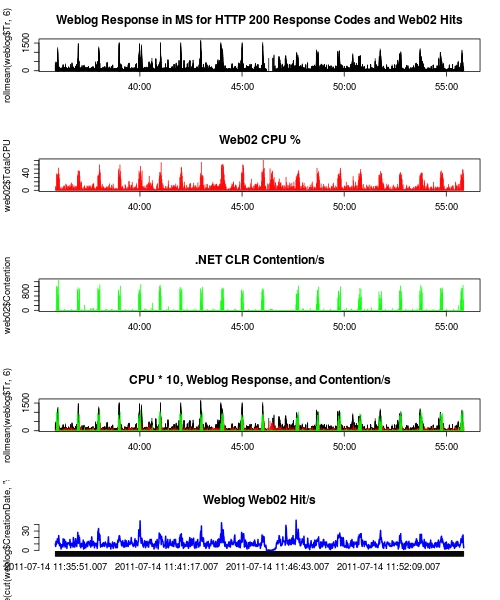
I have a feeling as I get to know R better I will discover more advanced ways to mine the data for things I am interested in. For now, plotting things like CPU and response time of web requests lets me visually find correlations without too much difficulty. After starting with CPU and web response time, I noticed that there was a correlation. Digging into this more, I found that response time for several requests will go up to over a second when the CPU spikes to around 60%. This also correlates with .NET lock contention as well (Larger Image, R Script):
Our SQL logging is currently losing entries, but there is enough data to see the correlation. I suspect with a full weblog data set the correlation will be even stronger. I have yet to find out the cause of these slowdowns that seem to happen about every minute, and am going to enlist some developers to get to the bottom of it (“Correlation does not imply causation”). I should point out that I checked another sample of weblog data when perfmon was not running to make sure the response time spikes were not a result of the monitoring itself.
The Difference?
If we looked at the CPU from something like Nagios it is going to look quite low (20%). This problem is unlikely to show up when using a profiler unless you just happen to load the page during these slow downs. High resolution monitoring allows you to discover issues like this that get buried with low sample rates. Also having a platform to view multiple data sources allows for the discovery of correlated metrics.
What is Next?
I don’t have a high resolution system deployed yet. So I need work on and think about:
- Scheduling Perfmon
- How to get the most representative samples
- Scheduling TCPDump and getting that data into R
- Scheduling Sar on the Linux boxes and getting that into R
- Automating parts of the analysis
I also need to discover more efficient ways to discover correlations and patterns in R with the data I am collecting. In short, the need for high resolution monitoring is becoming evident to me and there is a decent amount of work to get this deployed. As I explore this domain of monitoring I will get to know the caveats and develop systems for doing it more effectively.
In the next post I will talk a little about “Day to Day” monitoring with systems like Nagios, and how this data compares to higher resolution data in attributes and functionality.
Use Histograms to Visualize Response Time
Kyle Brandt
Just about every introductory class for algorithms teaches you three primary ways to look at algorithm performance:
- Worse Case Scenario
- Average Case Scenario
- Best Case Scenario (This is always followed up by why this isn’t very useful, but they mention it anyways).
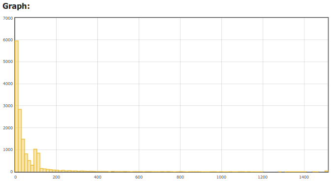
You can use this same sort of analysis when thinking about your web performance. I have found that a histogram captures all 3 of these pretty nicely since it is a distribution. The X axis is the response time in milliseconds of a request, and the Y axis is the number of hits that had that response time . Our HAProxy web logs capture the response time of each request from the perspective of the load balancer. This is a nice perspective because it includes pretty much the full stack of a web request that is directly under our control.
We have started to insert our web logs into SQL server. Raw SQL is hard to beat for deep analysis, but I have also started to build a web front end which is particularly useful for generating graphs easily. With a web interface it is easy to filter on certain criteria and you can easily see the distribution for a particular page or a certain client like Googlebot:
 (The X axis is the server response in MS, and the Y axis is number of hits that fell into that response bracket)
A crawler will also be a sort of worst case response time perspective on another level because because crawlers cause more cache misses. Clients will generally perform much differently. For example looking at response time for user agents with “Chrome” in them the response time has a very different shape:
In general, I always find it is best to think about how you are viewing your data, and if it is the best way to summarize what you really care about. Average is useful, but it just isn’t the complete picture.
A Network Administrator’s View:
When digging into some packet dumps to try to solve some issues I was seeing with our Broadcom network cards, something else caught my eye. When looking in Wireshark to see if there were TCP retransmits I didn’t see any in my capture but I did see a very large amount of TCP zero window messages between our web tier and our Database tier.
To follow this you need to be familiar with TCP flow control, so I will briefly cover this. Since TCP is full duplex, each side of the connection is both a sender and a receiver. However, you will often have one side doing more of one then the other. In this case with our sites it is the SQL server backend that plays the role of the sender and the web tier is the receiver. The reason for this is that the web tier just sends a database query which will be short, and the database server will send back the results of that query which will generally be larger than the query itself.
The rate of data transfer is controlled by the receiver telling the sender how much data it can receive. The amount of data that can be received is called the TCP Window. This window shrinks as the network buffers fill up. If the window fills up faster than the application retrieves the data from the network buffers then eventually the receiver will let the sender know that is can’t receive any more data for the time being. TCP informs the sender that it can’t receive more data by sending a TCP packet where the window size is zero — this is our zero window message. What this means in our case is that the sender (SQL server) is sending data to the receiver (the web servers) faster than they can process it.
So as a network administrator, if I don’t want to just blame the application, I look to what I can fix on the network side. One cause of this would be that if there is a lot a latency between the web tier and the database tier than the window might be too small. To check this the simplest way was to send pings up to the size of the MTU with the don’t fragment bit set and make them as rapid as possible. I did this but only saw peaks of 1-2 MS latency. Even if we take a view that the performance is worse than measured, the bandwidth delay product for this latency is ( (RWIN in Bytes)/(Latency) * 8 = (Max Throughput in Bits) ):
(65535/0.003) * 8 = 174,760,000
So this didn’t really seem to be the issue here since the bandwidth is lower than 174 mbit/s. Also, in Windows Server 2008 R2 there isn’t much you can do to enlarge the default window by using window scaling because Windows automatically controls this.
The other theory I had is that maybe somehow the network stack or network driver is not letting the application know that there is data to be retrieved fast enough. CPU usage is moderate so I figured that it was not a lack of processing power the web servers. The way the network stack will inform the application that there is data in the buffers is by sending an interrupt. Because at gigabit speeds interrupts can start to take up a lot of CPU power there are several tuning options for this. One option is to dedicate these interrupts to a certain core or group of cores. Another option that the NICs have to keep the interrupt CPU load low is interrupt moderation, this dampens the rate of interrupts by batching them. I tried tunning these various options to make the interrupts more frequent but I still saw a high rate of zero window messages.
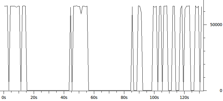
My skills as a network administrator pretty much hit a wall at this point and I didn’t get any network level answers on Server Fault that solved this issue for me. Next I turned to Stack Overflow to see if there was maybe a way to have .NET tell Windows to increase the size of the TCP window. My theory was that if the TCP window was bigger than it might stop bottoming out as it does in this graph of the average window size over time during my capture:
A Developer’s View:
When I asked about Speeding up the rate that IIS/.NET/LINQ retrieves data from the network buffers on Stack Overflow the pieces started to fall together with Remus’ answer. I wasn’t sure if what he was saying was the case, but I now had something to run with to try to get more information. With this information, I put on my admittedly somewhat shabby DBA hat.
A DBA’s View:
To verify that this might be the case I used the queries I had learned from Professional SQL Server 2008 Internals and Troubleshooting to view the SQL DMV of top wait times. One of the top wait times was async_network_io. This SQL server wait type means that SQL server has to wait because the client is not ready to receive all of the data it is sending. The problem with this DMV view is that it only shows total times since SQL server was restarted, and I needed to see which particular queries were causing the waits. So I turned to dba.stackexchange.com to try to find out how I could find the queries causing network waits safely in a production environment. The answers provided me with queries that I could run to take snapshots of queries. There were queries that frequently showed up with async_network_io wait times. I saw one query over and over again with 200-800MS of network wait. The query with “SELECT TOP 3000” and a whole wall of fields after it raised my eyebrows as that sounded like a lot of data to be sending back to the web server.
Not being that much of a DBA (at least, yet) this was about the end of the road for me. So I sent the top offenders I found to the developers and Brent Ozar.
Back to the Developer’s View:
Remus’ original answer had two theories for what might be going on:
- The client (web tier) was requesting more data than it should
- There was waiting going on while processing the data before fetching it all
The Top 3000 query was clearly more data than was probably needed and was a query constructed by LINQ. A large query in some ways make sense at first because the results of this query were aggressively cached. Also, for a while now our web tier has had CPU power to spare so moving processing to the web tier appears to be a good thing to do. However, returning large data sets to the web tier usually won’t work well, at least as part of a user request, due to the high network penalty.
The second theory is that a DataReader is being used to read the data one record at at time, and something is performed on each row before fetching the next record causing wait time between each query. I am not aware of any instances of this for our large queries yet. If there are such queries the solution might be to use a DataSet which would fetch all off the rows before processing them.
So the solution was to move the query to a background thread so it won’t slow down user response time, and of course make the query more limited in the amount of data it returns.
Back to the Network View, Meta is Murder:
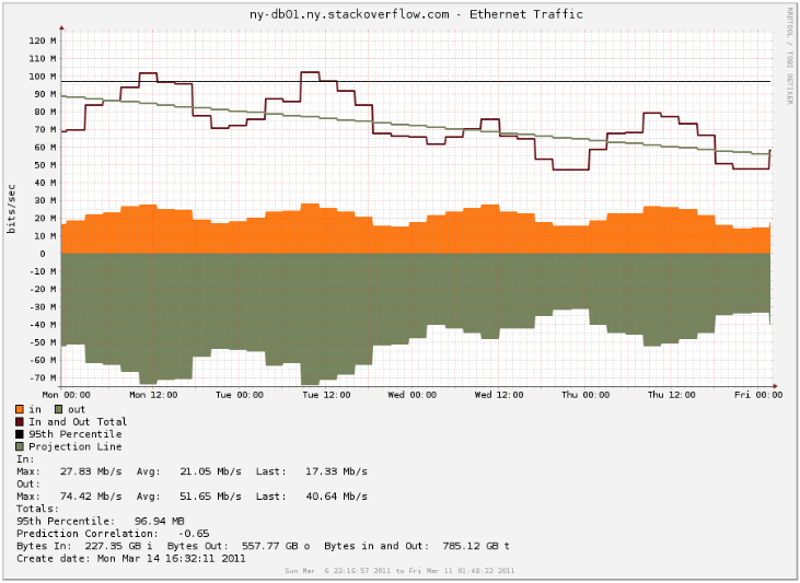
The most shocking thing is that after this query was adjusted the amount of data being sent from the database sever dropped about 20mbit/s (Notice the difference between Tuesday and Wednesday during peak hours):
So was this query really pulling this much data even though it isn’t running that frequently? The answer is both yes and no.
Since TCP/IP and Ethernet carries overhead for the headers part of the data going over the wire is just meta data added by the network. The minimal amount of TCP/IP and ethernet overhead is (See this page for more information):
(1500-40)/(38+1500) = 94.9285 % IPv4, minimal headers
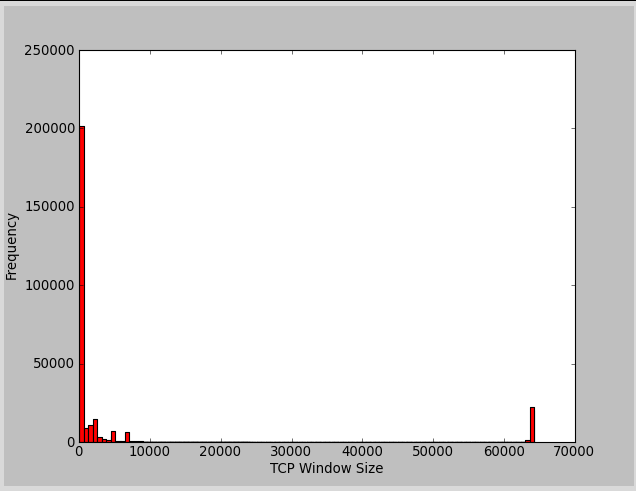
So at an optimal window TCP window size each packet will have the maximum amount of user data of 1460 bytes (without jumbo frames/vlan tagging/etc). The 78 bytes of overhead in this case is about 5% of overhead (78.00/1538.00). When our network is not hitting zero window messages the window sizes were often around 200 bytes. I made a histogram of my capture to show just how often it was in the range of small windows (resolution isn’t there to show it, but most of it is around 200):
The window size of a TCP packet will be the size of payload data minus 8 bytes since the window size is everything beyond the acknowledgement number in a TCP packet (I might be off on this calculation, I could not find a direct reference to verify this). So with a window size of 200 bytes we are sending 194 bytes of user data in a packet. So with this we have 70 bytes of overhead and 194 bytes of user data which is about 27% of overhead.
So when transferring about 100 mbit/s of user data you would only see about 5 mbit/s of extra data in the SNMP octets counters with a good window size, so from the SNMP view the transfer rate would be 105 mbit/s. When transferring 100 mbit/s of user data with a window size around 200 bytes there is 27% overhead and you end up with about 27 megabits a second of overhead for 127 mbit/s of traffic from the SNMP view. This ignores any overhead provided by the application level protocol that the web tier uses to speak to SQL server.
This pattern of window sizes is referred to as “Silly Window Syndrome” since the meta data can start to overtake the actual amount of user data being transfered. This overhead explains the large drop in database traffic beyond just reducing the amount of query data returned.
Lessons Learned
I think the biggest lesson is that the full view of many problems is missed unless each person in the team has at least some understanding of what is going on from other team members views. Also, the communication between different specialists is needed to solve many issues. In this case what looked initially to me like a networking problem was actually a symptom. Trying to attack the problem solely as a network administrator was treating the symptom, not the disease.
From a technical standpoint the difference between having the web tier and SQL servers on the same box compared to having a network connection between them is important. Things may work well on a single server, but when the data needs to be moved over the network shifting the load to web servers might not always work.
We still have a good amount of zero window packets going back and forth, so although the worse offenders have been mitigated I believe there is still might be work to do.
Some Tips for Better RRD Graphs
Kyle Brandt
RRD graphs are used by a lot of monitoring tools such as Cacti, Munin, and n2rrd (the Nagios plugin we are currently using). Editing RRD graph templates yourself isn’t terribly hard and is worth while since they are part of many of the graphing solutions available. Also by learning how to write the graph templates you can create your own graphs combining different data with complete freedom.
Bigger is Better:
At Stack Overflow we are spoiled with 30 inch monitors with a 2560×1600 resolution. Looking at a Cacti instance, which I think is a default setup, has graphs of 603×280. If everyone has the screen real estate don’t waste it and go ahead and make these graphs a lot bigger so you can see more information. Consider doubling or even tripling the size.
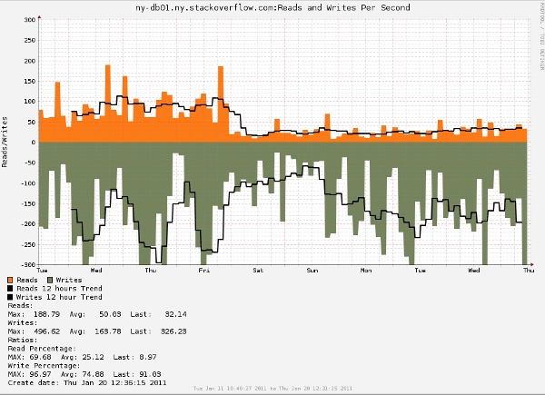
When making them bigger think also about the ratio of width to height. If you make the graph a tall one but not as wide it will exaggerate value differences better if that is what you are looking for.
Consider hard limits for vertical boundaries:
If you have a spiky graph, but care more about seeing detailed changes in the normal values the automatic graph scaling can get out of preportion for the information you are trying to get. What happens is the graph zooms out so the spike data is included fully in the graph. You can put hard limits on the y-axis values and allow the spikes to get cut off so you get more detail on the information you actually want. You can do this with the rigid option:
-u 300
-l "-300"
--rigid
Show values as negatives:
This could go either way as it confuses some people, but I find it helpful. You can “CDEF” a value to make it negative and make the graph less cluttered.
So for example:
CDEF:NegWrites=Writes,-1,*
I find that this works well for graphs with two values that generally go together and will never have actual negative values such as read/writes, network input/output, and GET/POST HTTP methods. However if you find this inverse visualization confusing then it is best to just differentiate in other ways.
Use trends:
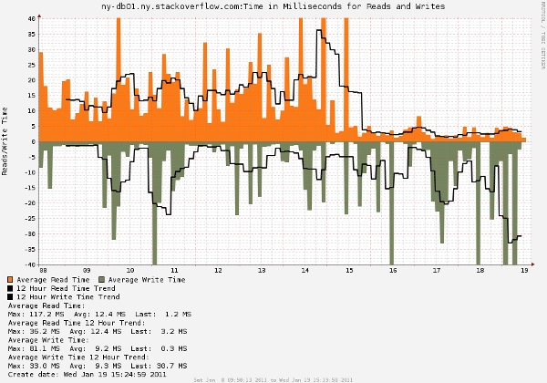
If a graph is too spiky to see the patterns consider using the trend function. Over larger periods of time RRD graphs naturally eliminate the spikes as data is consolidated, however trends are very helpful for seeing patterns in shorter time frames. The trend creates a sliding window average of a specified time frame. So for example to get the 12 hour trend in the above graph I used the following:
"CDEF:ReadTrend=Reads,43200,TREND"
You can read more about the details of this function and other functions like it in the graph_rpn documentation.
Include helpful calculations:
One of the nice things with RRD graphs is that you can do calculations and display them at the bottom. A common one is to include the the 95th percentile on Internet bandwidth graphs since this is a common method of billing.
For my read/write graphs I set up a write percentage and a read percentage:
RRD does use RPN (Reverse Polish Notation) but writing rules such as these is not too bad once you play around with the notation a little.
"CDEF:IOPS=Reads,Writes,+"
"CDEF:PerReads=Reads,IOPS,/,100,"
"CDEF:PerWrites=Writes,IOPS,/,100,"
They are actually useful:
Before I made these changes the default graph I had for both read/writes per second and the amount of time they took was:
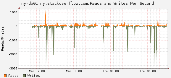
Sure it looks like a graph — but it is pretty useless.
I picked these graphs as examples not only because they show my points about the graph tips but also because they show the results of our recent 32 GB database RAM upgrade. As expected right after the upgrade there was a drop in both the amount of reads on our database drive and the amount of time reads take. This is because more of the data being read is hitting the memory cache. Also, since less reads are being done there is less load on the array and the reads are faster. This didn’t have any significant impact on writes since all writes need to be flushed to disk (or at least the RAID/Disk cache which is the disk as far as the OS is concerned). In theory I would think less reads would alleviate some of the write pressure as well on the array — but this doesn’t seem to be the case to any significant extent (I would have to make the graph adjusted against something like the amount of traffic or DB queries to see a change if there is one). Had I stuck with that useless graph then this change would not have been obvious without some data analysis.


