Just about every introductory class for algorithms teaches you three primary ways to look at algorithm performance:

  • Worse Case Scenario
  • Average Case Scenario
  • Best Case Scenario (This is always followed up by why this isn’t very useful, but they mention it anyways).

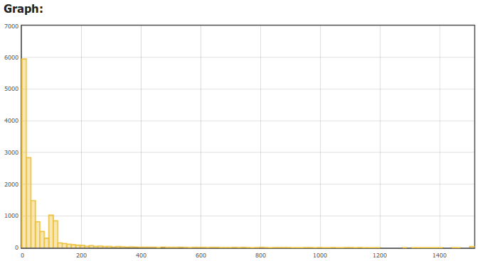
You can use this same sort of analysis when thinking about your web performance. I have found that a histogram captures all 3 of these pretty nicely since it is a distribution. The X axis is the response time in milliseconds of a request, and the Y axis is the number of hits that had that response time . Our HAProxy web logs capture the response time of each request from the perspective of the load balancer. This is a nice perspective because it includes pretty much the full stack of a web request that is directly under our control.

We have started to insert our web logs into SQL server. Raw SQL is hard to beat for deep analysis, but I have also started to build a web front end which is particularly useful for generating graphs easily. With a web interface it is easy to filter on certain criteria and you can easily see the distribution for a particular page or a certain client like Googlebot:

(The X axis is the server response in MS, and the Y axis is number of hits that fell into that response bracket)

A crawler will also be a sort of worst case response time perspective on another level because because crawlers cause more cache misses. Clients will generally perform much differently. For example looking at response time for user agents with “Chrome” in them the response time has a very different shape:

In general, I always find it is best to think about how you are viewing your data, and if it is the best way to summarize what you really care about. Average is useful, but it just isn’t the complete picture.
«
»
  • Joe

    See those at 15sec? Those are all me.

    • @Joe. That would be 1.5 sec, not 15 seconds. And actually that last bracket is 1.5 secs or greater with the way I do it.

      • Joe

        Whoops. I guess I should pay closer attention to the units. I didn’t realize these were all Googlebots either and therefore not my connection.

  • Thanks great article. Would you be willing to share some details on inserting the logs SQL server? Is it done continuously, in batches, or did you do it manually just for this analysis? I’m definitely going to do the same thing!

    • Hi Russell,

      We made a daemon in C# that listens for syslog data, parses it using a regex, and inserts into SQL server every 2000 rows.

    • Russel,

      Read through Etsy’s method for creating graphs for just about anything using Node.js and Graphite.  I don’t know about HA, but if it has some signalling or event handling mechanism when writing to logs then Graphite should do.

      Flickr uses RRD tool for similar purposes.

       http://codeascraft.etsy.com/2011/02/15/measure-anything-measure-everything/ http://code.flickr.com/blog/2008/10/27/counting-timing/

  • Jim

    What is the default duration i.e. how many log lines are you considering in each histogram? Great article and tip btw.

    • Hi Jim, that one was just that past 30 minutes of activity. Since it is a distribution, it looks the same after just 10 minutes or so.

  • Christian van Eeden

    What are you using to generate the Graphs?

    • Hi Christian,

      I use a jQuery plugin called flot.

      • Chris

        Hi Kyle,  I am trying plot histogram using flot. I came across to your page while searching for something helpful. Could you give me some hint how to do it? I have already used flot to plot scatter plot, bar char, line chart,… but I couldn’t find any plugin for histogram.  Thank you in advance!

  • I tend to find that a summary of the histogram is enough – plotting the long tail doesn’t often provide additional interesting insights. floor, median, 90%-tile, additional nines as appropriate to your circumstance and data volumes.

  • Mxx

    Would be interesting to actually drill down to some of those bars to see if there’s some correlation/pattern. Like in the 2nd graph you have 2 spikes at ~100ms…would those be from some slow(er) backend server or a lot of users from some distant geographic/network region..

    • Hi Mxx,

      Well geography shouldn’t matter because these are the response times from the perspective of our load balancer.

      As far as drilling down into the bars, that shouldn’t actually be too hard. I might try to add that as a feature.

      -Kyle

      • Mxx

        Is it capturing ‘time to 1st byte’ or ‘total request time'(which would include time to send content)?

        Also from historical point of view would be interesting to see a heatmap of all response times. X-axis could be a timestamp, Y-axis would be response time, color would be number of responses at that ms(from blue=0 to green=’acceptable to you time’ to red=’unacceptable time’). This way you could historically see how your infrastructure response time changes.

  • Pingback: Sysadmin Sunday #29 « Boxed Ice Blog()