Monitoring Systems – Your best friend. Really.
Peter Grace
At some point in your career as a Systems Administrator or other Person-Of-Responsibility-in-IT, you will find yourself stuck in the unfortunate position of cleaning up a mess that was totally preventable, if you had known the signs beforehand that the problem was imminent. This fact is 100% assurable, as I have yet to meet a seasoned SysAdmin who didn’t have a war story similar to “man, if I was only monitoring disk space on server X…”
Monitoring is an extremely important tool in your arsenal of preventative measures. Monitoring is important for a great deal of different reasons:
- Monitoring allows you to send alerts if certain conditions are met,
- It allows you to visualize trends in data,
- Provides a method of assurance to the customer that their consumed services are guarded,
- Allows you to do internal benchmarking for when you need to come up with budget/spend numbers.
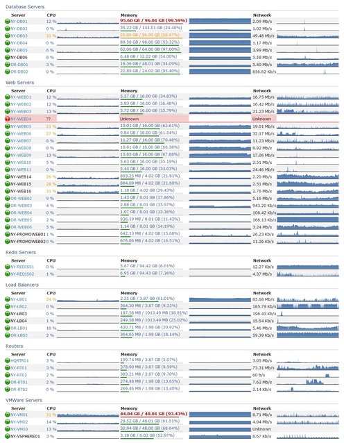
There are many different products in the monitoring sphere. Some are extremely expensive and meant only for enterprise use and there are many that are open source and therefore free to use. My personal favorite is Nagios, though it does have some shortcomings that I will touch on later. Most monitoring systems follow the same basic recipe: You configure hosts, which in turn have services or metrics you want to monitor. The monitoring system will “optionally” alert you if you configure it to do so. Most monitoring systems have a method of keeping historical data and graphing it. This is not only a great way for you to look at pretty graphs; the management staff will get excited seeing information visualized in a way they’re used to seeing.
There are several methods of monitoring. The most basic and least useful method alone is a simple ping test. Products that provide this feature give you a simple up/down alert if there’s an outage, but honestly, the users breaking down your door will be a more effective alert. Most monitoring systems will give you the ability to not only run ping tests, but also have checks that incorporate SNMP (Simple Network Monitoring Protocol) statistics. This is better than a simple ping test, but in my opinion still short of the complete picture I’d like to see. SNMP does have its benefits, though: since it’s been around practically since the beginning of time, lots of equipment supports it out-of-the-box. It’s the primary method one uses to gather statistics about your routers and switch interfaces, including drops/discards and packet saturation rates.
Going beyond simple ping and snmp monitoring, many monitoring applications allow you to have custom checks that give you metrics for items SNMP misses.
For instance, the nagios plugin exchange provides a plethora of check-metrics that other users have written with varied themes from temperature probe
monitoring to advanced Microsoft SQL statistics checking. In particular, one Nagios addon that I cannot live without is the “nagios-wsc” project, which you
install on a windows IIS server and it in turn provides the ability for Nagios to check windows statistics over WMI. Being able to do this vastly
improves the metrics you can extract from windows servers. At the time of this writing, I’m not sure if a similar interface for PowerShell exists or is
in the works, but that would be a “must-have” addon, as Microsoft has said that they’re moving away from WMI in favor of PowerShell, at least as far as Exchange
is concerned. (As commenter Jim Butts points out, I don’t have citation for this and so I’m going to strike it from the post, though I swear I remember reading at one point that Microsoft intended to replace WMI with PowerShell. This might have only been related to the Exchange family of products, though, so don’t take it as gospel. Also worth noting, as another commenter explained, WMI and PowerShell are two different technologies meant to do two different things. WMI is an instrumentation interface, whereas PowerShell is a scripting language. It just so happens that you can get some information with PowerShell that you cannot easily get through the WMI interface.)
One of the major pieces of any monitoring environment is the ability to alert administrators of an impending problem. Many admins default to e-mail for this, but not many people realize that most mobile phones are fantastic SMS modems. Find a prepaid model that lets you send SMS’s from a serial/usb connection via AT commands, and now you have not only an out-of-band notification method, but you’ve saved yourself a bunch of money on specialist hardware. I’ve also heard of some people using Asterisk to do voice-dial alerts; when the alert hits the system, it Text-to-Speech’s the alert and then plays the audio over a telephone call to the remote party. Pretty slick and high tech, but in my opinion that’s a rather big system to rely on for monitoring. Generally, simple methods of alerting, with less moving parts, makes for a more stable and trustworthy alerting platform.
A helpful part of many monitoring systems is being able to group hosts and services into logical containers. This ability lets you not only monitor a whole logical service from one view, but also allows you to quick-add new servers to a group and immediately have that server’s checks already applied to it by virtue of being a member of the host or service group. If your monitoring system supports grouping and you are not using it “you are doing it wrong.”
Do you need a monitoring environment? Yes. There is no other answer to this question. If you have even a single server in your environment, monitoring it will provide a treasure trove of information about the system. The only question is, how much do I have to monitor? This depends a lot on your customer SLAs and the expectactions of uptime. As the uptime target grows and the margin for error shrinks, you will need to squeeze more and more information out of your environment to maximize the “magic twilight” between a server showing symptoms of impending troubles and “THE SYSTEM IS DOWN.”
Having a lot of stuff monitored also helps with correlation and causation. For instance, you might have a website error showing up on one of your servers, and you start diagnosing that error. Thirty minutes later, you come to find the problem was that the SQL server is bogged down and replying to queries too slowly. If you were just monitoring the web server, you just lost thirty minutes. If you were monitoring both the SQL and the web server, you would have a greater chance of knowing that the problem lay with SQL, not with the web server. All of this data can lead to a condition I call “data addiction,” and it’s a condition that I will attest is pervasive at Stack Exchange. Many of our developers rely heavily on our monitoring data to give them metrics into how the sites are operating.
One thing that needs to be considered when you setup monitoring is the “Who Watches The Watcher” paradox. Simply put, if you become reliant on your monitoring system, you want to trust that the monitoring system is active. There are a few ways to solve this. First off, if your organization has multiple sites, setup a monitoring server at each site and have the monitoring servers monitor each other as well as their other systems. If you have only a single site, then you should probably consider getting a simpler monitoring system to monitor your monitoring system. You’ll never be able to have 100% faith that your monitoring system is foolproof, it’s tough to rely on software that was written by human hands to be 100% failure free, all the time. Regularly auditing the monitoring environment is the best way to keep your faith in the system.
In closing, I’d like to reiterate that even if you feel you don’t need a monitoring system, I’m pretty sure you would still benefit from one. Start small if this is your first time; if you run into issues, sites like ServerFault are a great resource to get good answers. Over time, I think you’ll grow to enjoy having the peace of mind that comes from knowing what your network is doing without having to spend additional time manually collecting statistics on your own.
A Studied Approach at WiFi – Part 2
Peter Grace
Welcome back to my series on WiFi. In Part 1 of the series, I began with some basics of RF and explained some differences about antennas. It should be apparent at this point that there is a science behind this activity, and I’ll take this moment to warn you thoroughly before we move on: These posts are a good way for you to become familiar with WiFi and should provide you with some solid knowledge to help improve your WiFi coverage. However, this brief education is not a replacement for having an actual RF engineer do a site survey of your environment! If you have a “must work right the first time” environment, and you’re reading this because you’re the decision-maker and don’t have the slightest hint about what all this is about, Get An Expert. They do this all day long. It’s money well spent.
If you do use these techniques below, Your Mileage May Vary. It’s also important to note that if you go to all this work, setup your access points, then your neighbor goes and installs his AP right next to yours on the same channel, then you’re going to be stuck re-doing these activities all over again. WiFi isn’t a static situation; as people get more WiFi-connected devices, the playing field changes, and it will change on you, I guarantee it.
Understanding RF Interference and What It Does to WiFi
You hear people joke about microwave ovens interfering with WiFi equipment pretty often. Most people laugh it off as an urban legend. It’s not. Below, I have included some RF spectrograms for your entertainment. If you haven’t seen images like this before, they are a visualization of signal frequency and intensity over time. Past-to-present is a top-to-bottom relationship, and the colors are a heatmap (with red being a strong signal.) As you look at both types of graphs, the channels start from 1 at the left hand side of the graph, and go up through 12 in the right hand side. NOTE: Quick Shout-Out to the guys at metageek.net for creating the awesome Wi-Spy and accompanying Chanalyzer Pro software. We paid full price for the DBx bundle (Comes with the Wi-Spy DBx and Chanalyzer Pro) and I definitely feel like it was money well spent. Check them out if you want to do these types of visualizations yourself.
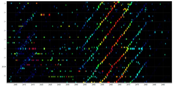
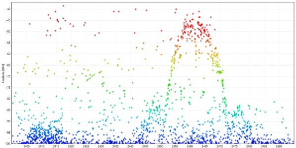
These images show what the wireless signal looks like in my suburban home. Not a lot of interference in this visualization, you can see my home Cisco Aironet 1240 AP humming along happily as visualized by the wavy lines in the waterfall spectrogram, above. In the lower graph, we see signal strength (Amplitude) measured by frequency.
Let’s shake things up, and show what happens when you fire up a microwave oven:
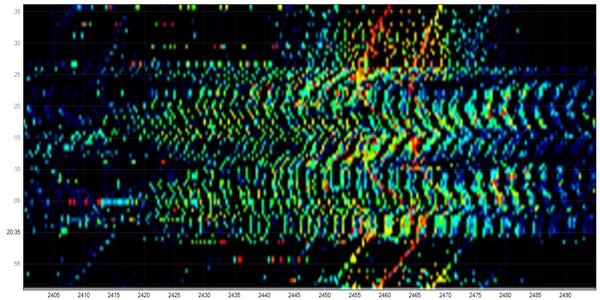
Look out, here comes that microwave burrito exploding all over your RF Spectrum! For about 30 seconds, I nuked a mug of water and this was the result. You can see through the swamp of RF that the access point does its best to compensate for the signal interference, but that’s a pretty strong blast of RFI.
Do you have a baby monitor at home? Is it on 2.4ghz? Ready to see what it’s doing to your wireless signal?
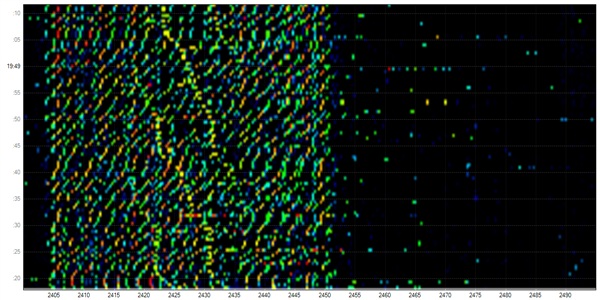
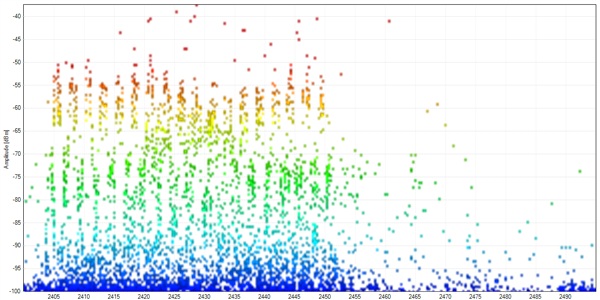
These two charts were captures I took from my friend’s house (incidentally, the gentleman who I mentioned in the previous post — he has a penchant for wifi problems.) I was over his house and ran some traces to get a visualization of his wireless conditions in preparation for installing a new wireless router. I asked him if he noticed the WiFi being slower at night and he’d mentioned that it did indeed seem to be more problematic at night. Welcome to the wonderful world of random equipment in your home causing issues with your wifi. In the above trace, you can see the telltale wavy lines of the access point, trying to power its way through the interference. The graph below has just the slighest hint of bell curve, which is where his AP was situated in the RF Spectrum. I believe in this case his AP was on channel 3. Needless to say, we popped his new wifi router on channel 11, which is quiet in these graphs.
One final graph to show. If you scroll back up to the initial image I showed of my suburban home, this will give you an idea of what your general household’s 2.4gHz spectrum might look like. Now, compare that image to this:
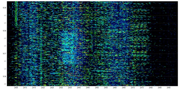
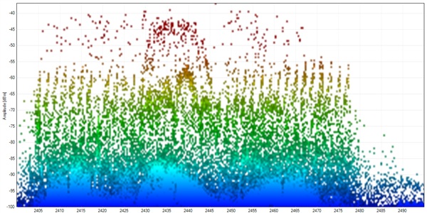
This, my friends, is what the 2.4gHz spectrum looks from the Stack Exchange offices. We’re located down by Wall Street, on the 26th Floor of One Exchange Plaza. Our scenic vantage point does come with a cost! These spectrograms show just how much RF interference we are subject to at this location. Astute readers may notice the timescale difference on the graphic, but I assure you that the 30 second view is just as nasty.
What can we take away from these charts? One could safely summarize this entire section as “Location and the gadgets in your home both play a significant role in how your WiFi might perform.”
Mapping Your Wireless Landscape
It’s worth noting that even though the above charts were taken using a very expensive measuring tool, your laptop’s WiFi card is a potent ally in your quest to improve your coverage. For the next section, I am assuming that you firstly are running Windows and have downloaded and installed both Vistumbler as well as Microsoft SQL express. I am aware that a strong number of our readership are Linux based, and there is also a big Mac contingent. I’ll unabashedly say that the steps I’m following and the software choices I made were purely for my convenience, but I hope that I explain the process in easy enough terms so that the tinkerers out there can take the wheat from the chaff, so to speak.
Step 1 – Take some measurements!
Vistumbler is a wardriving utility that, when attached to a gps, can help you map where there are wireless access points in range of your device. We’re going to borrow it for a more sedentary purpose. Fire up Vistumbler, set your laptop in the areas where you want to consume your WiFi signal, and then start the scan/capture process. Leave the laptop there for at least 30-60 minutes, as we want a whole lot of datapoints to work with. It will keep track of every time it hears of an access point and record the relative strength of the signal. Once the time is up, you can either run the detailed export to CSV now, or “Exit (Save DB)” and come back to export the file later. NOTE: If you’re in a tight urban region like we are at Stack Exchange, leaving Vistumbler up for 30+ minutes will result in a tremendous amount of data! It’s wise to have a very powerful PC to handle the vistumbler export process, or do seperate scans and aggregate the data together in a later step.
Step 2 – Massage the data!
Sadly, Vistumbler’s export to CSV does leave a bit to be desired with its field quoting. We’re going to open the csv in Excel, since it seems to be especially forgiving. Once we’ve opened it in Excel, we’ll do the following steps:
- Make a new column for Location. Populate the column with a location name. You’ll want this when you’re querying SQL later on.
- Save the file as an Excel spreadsheet.
- Fire up SQL Server Management Studio.
- Create a new database if you don’t already have a good scratch database, then right-click the db and select tasks->import data.
- Using “Microsoft Excel” as a datasource, submit your new excel file as the source data. HINT: If you’re getting an error about unable to find a particular OLE provider, and you’re on 2010 like me, with 64bit windows, you will likely need this link to load said provider.
- Select the destination database; elementary stuff here. From this point on, “Just Keep Hitting Next,” except for the prompt where you specify the destination table name. I strongly advise you to change that name to something easier to type rather than the default date/time string. Finally, Finish to start the import job. This may take a while, so don’t be afraid if it seems like it’s taking too long.
- Repeat these steps for each file of data. Be sure to specify the same table name for each import, it will append to the database.
Step 3 – Analyze!
With this complete, congratulations! You now have data in a sql server that you can use to leverage the power of SQL to get some statistics from. I’ll admit I’m a SQL neophyte — I can do some joins and “GROUP BY”s but I’m sure others could tease a lot more information out of it than I have. Here are some basic queries for your dataporn pleasure:
Get a sorted list of strongest access points across all locations:
select LOCATION, SSID, AVG(SIGNAL) AS AVGSIGNAL
FROM [dbo].[wifilog]
GROUP BY LOCATION,SSID
ORDER BY AVGSIGNAL DESC
| LOCATION | SSID | AVGSIGNAL |
| sysadmin | SO-GUEST | 90 |
| cantremember | SO-GUEST | 89.7431436154527 |
| cantremember | NULL | 73.9324583394779 |
| cantremember | ROVIO | 70.6069006192864 |
| sysadmin | ROVIO | 69.875 |
| sysadmin | NULL | 61.5 |
| sysadmin | hpsetup | 61 |
| cantremember | Grusslife | 60.2857564140372 |
| sysadmin | Grusslife | 59.5625 |
| cantremember | HPC7B114 | 55.2590909090909 |
In the above query, we see that in our sysadmin office, as well as somewhere in our office (for shame, I forget where I took the trace!) the strongest signals are SO-GUEST (our current guest wireless AP) and ROVIO (for our cute little mobile webcam.) We’ve also got a couple shadow AP’s (as specified by NULL) followed up by some other AP’s that I’m not sure who or where they are. Suffice to say, our current AP is pretty strong in these two locations.
Find the average signal strength of all APs at a particular location:
select SSID, AVG(SIGNAL) AS AVGSIGNAL
FROM [dbo].[wifilog]
WHERE LOCATION='sysadmin'
GROUP BY SSID
ORDER BY AVGSIGNAL DESC
| SSID | AVGSIGNAL |
| SO-GUEST | 90 |
| ROVIO | 69.875 |
| NULL | 61.5 |
| hpsetup | 61 |
| Grusslife | 59.5625 |
| Akin Law | 55 |
Similar to the first query, you can drill down by a particular location and see the top AP’s seen at that location. This is useful, but what we’re really looking for is the least used channels at a certain location.
Get a channel utilization chart
select LOCATION,CHANNEL,SSID,AVG(SIGNAL) AS AVGSIGNAL
FROM [dbo].[wifilog]
GROUP BY LOCATION,CHANNEL,SSID
ORDER BY AVGSIGNAL DESC
| LOCATION | CHANNEL | SSID | AVGSIGNAL |
| cantremember | 8 | NULL | 90.034808259587 |
| sysadmin | 8 | SO-GUEST | 90 |
| cantremember | 8 | SO-GUEST | 89.7431436154527 |
| sysadmin | 8 | NULL | 88 |
| cantremember | 11 | ROVIO | 70.6069006192864 |
| sysadmin | 11 | ROVIO | 69.875 |
| sysadmin | 6 | hpsetup | 61 |
| cantremember | 11 | Grusslife | 60.2857564140372 |
| sysadmin | 11 | Grusslife | 59.5625 |
The above gives us some pretty useful information. We can see here that channels 8 and 11 have several entries, and only one device in range of our scans is on channel 6. Using some critical thinking, it’d indicate that channel 3 might be a good choice should we want to add a new AP to this environment. Lets massage the query a bit to see if that’s confirmed by our other data:
select LOCATION,CHANNEL,SSID,AVG(SIGNAL) AS AVGSIGNAL
FROM [dbo].[wifilog]
WHERE CHANNEL in (1,2,3,4,5,6)
GROUP BY LOCATION,CHANNEL,SSID
ORDER BY AVGSIGNAL DESC
| LOCATION | CHANNEL | SSID | AVGSIGNAL |
| sysadmin | 6 | hpsetup | 61 |
| cantremember | 2 | NULL | 57.8348569743439 |
| sysadmin | 1 | cisco-voice-axiomSL | 55 |
| sysadmin | 6 | Akin Law | 55 |
| sysadmin | 1 | cisco-data-axiomSL | 55 |
| cantremember | 6 | Akin Law | 54.2220583898555 |
| cantremember | 2 | BLUESKY-NYC | 51.3716814159292 |
| sysadmin | 2 | BLUESKY-NYC | 51 |
| sysadmin | 1 | cisco-scan-axiomSL | 51 |
| cantremember | 6 | OpenWrt | 50.7345132743363 |
| sysadmin | 6 | OpenWrt | 50 |
| cantremember | 6 | EPAD | 49.154272517321 |
| cantremember | 1 | FGAwireless | 48.0518896220756 |
| sysadmin | 6 | EPAD | 48 |
| cantremember | 1 | cisco-voice-axiomSL | 47.982855143457 |
| cantremember | 1 | cisco-scan-axiomSL | 47.9389792899408 |
| cantremember | 1 | cisco-data-axiomSL | 47.4301110385369 |
| sysadmin | 6 | VX7E7 | 46 |
| cantremember | 4 | Corner | 45.3483043079743 |
At first blush, one might be enthusiastic about channel 3 given the fact it’s not used as the main carrier frequency in any of our entries. Be careful, though, for WiFi channels have some pretty strong overlap:
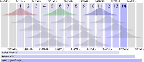
As this graphic shows, each wifi “Channel” is merely just a 5MHz swatch of the 2.4ghz ISM band. WiFi signals have a 22Mhz bandwidth, so realistically there’s only 3 channels one can use in an environment without any fear of interference or overlap. Because of this, one needs to take into account not only the channel but also the signal strength of potentially interfering access points.
In our case at Stack Exchange, there are just so many APs utilizing so many channels that we’ve ultimately decided to go with a Cisco controller-based access point layout, which will dynamically change channels based on signal conditions in realtime. For those of us at home, this is way too expensive of an option for most. Sadly, we’ll just have to take these data queries and give it our best shot.
I hope this blog series helps you a bit with your next WiFi installation. In summary:
- Antenna choice matters when you’re trying to cut through interference or travel long distances.
- Most residential building materials will not diffuse wireless signals to an appreciable amount unless you’re talking about very far distances, (i.e. trying to use your laptop on the third floor at the far side of your house when the AP is in the basement, for instance.)
- Be aware of electronics in your home that might share the 2.4GHz radio spectrum; they can seriously affect your wireless transfer rate and signal strength.
- Apps like Vistumbler can catalog used channels in your environment and you can then use this data to find a quiet spot in the spectrum.
As always, I welcome your comments and criticisms, below. Also, feel free to share any specific SQL queries you used that might help glean even more information from the datasets you’ve gathered!

